I’m a big fan of Android. If you don’t know what Android is, stop reading now.
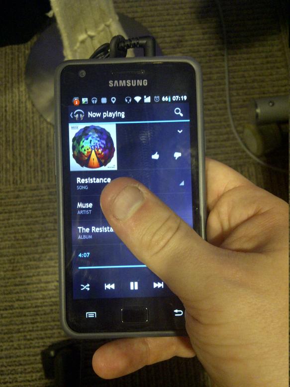
However, with this whole new ICS / Android v4.0 new UI paradigm thingie, I’ve noticed a problem. Take, for example, the new Google Music app running on my Samsung Galaxy SII.

Notice my giant, fat, stubby finger, waiting to pounce on any of the random UI elements that might be presented to me. Smart people will realise that right-handed people who hold their phone with one hand will vastly prefer to press buttons that are nearer the bottom right-hand corner of the screen than to the top left hand corner. This is why the most commonly-used soft button “back” is down there. Google have handily put the playback controls on the bottom as well. However, guess how I get back to the previous ‘view’, say if i wanted to go back to the current album list? That’s right, I hit this button:
See the problem? I can’t reach it. That’s not the only problem - there’s now two buttons on my UI that mean ‘back’ but do different things. If I hit the conventional ‘back’ softkey in the bottom right, that just takes me back to the homescreen (if I get to music from the music widget). Basically, to view what else is in the application, I need either two hands or a remarkable amount of dexterity and hope that I don’t drop the phone.
It seems to me that this is due to one, or all of the following:
- I’ve got stubby fingers
- I’m holding it wrong
- The phone’s got a 4.3” screen
- Google have put the button in a bad place
I’m not saying I know what the right answer is, but this just seems a little wrong. It’s even now codefied in Google’s new Android design guidelines (see the Common App UI bit at the bottom) - they want the ‘Main action bar’ to be at the top. The main way to do anything within a typical app is for the thumb to magically extend itself by a couple of inches so you can reach the buttons.
Maybe the buttons should be at the bottom. Maybe phones should be smaller. Maybe I’m genetically inferior. What’s interesting is that Apple have been doing this for a while in IOS - those familiar will know that the main place to look for a ‘back’ button is in the top left. E.g.:

This probably works for IOS, because the iPhone only has a 3.5” screen, so even my diminuative hands should be able to reach it. There’s a whole bunch of rumours about the next iPhone having a much bigger screen. I’m curious to know if Apple, who are typically renowned for their UI guidelines, will have anything to say about button placement in the top left of the screen on the newer, bigger devices.